Plot scatter#
This notebook will help you generate a scatterplot in Python. Scatterplots help us visually inspect the relationship between two continuous variables. This notebook should be used to plot your resistance vs. time constant observations from the RC circuit lab, for example.
After plotting, we’ll also show how to generate a linear regression line for your data. Linear regression is a common tool to model a linear relationship between two variables.
If you’re new to Jupyter Notebooks and/or Python, please be sure to work through the Introduction notebook before this one.
Setup#
At the start of almost every coding notebook, we’ll import the packages we need. To plot our scatter plot, we just need package: matplotlib.pyplot.
Task: Import the
matplotlib.pyplotpackage asplt, just as you did in the introduction notebook.
# Import necessary packages here


# The line below makes the figures generate in higher resolution
%config InlineBackend.figure_format = 'retina'
Define values to plot#
With matplotlib imported, we can now use the scatter function by calling plt.scatter(). However, we need to define what to plot first. One straightforward way to think about this is to define an x variable and a y variable. Below, there are lists of values (defined in brackets [ ]) assigned to x and y. Replace these with your own values, depending on what you’d like to plot on the x and y axis.
Note: Remember that in a scatterplot, each dot has both an x and a y value. Therefore, these lists should be the same length. The coordinate for each point will be the values at the same index in x and y. For example, the coordinate for the very first point will be x[0],y[0].
# Replace the values below with your scatterplot values
x = [1,2,3,4,5,6]
y = [4,5,6,7,8,9]
Plot & label#
We can now plot our values using the code below. Remember that you can add axis labels using plt.xlabel(). If you need a reminder for how to do this, refer to the Introduction notebook.
plt.scatter(x,y)

# Add labels here

plt.show()
Task: Create a cell below with the code above. Add code where it says
# Add labels hereto label your axes.
Add a linear regression line#
If we have an a priori hypothesis about the relationship between our variables, or would like to predict additional data points, we can attempt to fit a linear regression line to our data. To do so, we will do the following:
Import two more packages:
numpy(numerical python; the convention is to import this asnp) and thestatspackage fromscipy(scientific python).Convert our x and y lists into arrays, so that we can perform math on them.
Perform a linear regression using
linregress()from thestatslibrary. Thelinregress()function calculates a linear least-squares regression for two sets of measurements. It returns several parameters, including the slope (slope), the y-intercept (intercept), the correlation coefficient (r_value), the two-tailed p-value (p_value), and the standard error of the estimate (std_err).Plot the regression line, using the computed slope and intercept to construct it (mx+b).
Plot the original data points.
# 1 - Import additional packages
import numpy as np
from scipy import stats

# 2 - Convert x and y to numpy arrays
x_array = np.array(x)
y_array = np.array(y)

# 3 - Perform linear regression
slope, intercept, r_value, p_value, std_err = stats.linregress(x_array,y_array)

# 4 - Plot a regression line, using the slope & intercept
plt.plot(x_array, slope*x_array+intercept, color='gray',label='fitted line')

# 5 - Plot our original data points and show
plt.scatter(x_array,y_array,label='original data')
plt.legend()
plt.show()
---------------------------------------------------------------------------
NameError                                 Traceback (most recent call last)
Cell In[3], line 13
     10 slope, intercept, r_value, p_value, std_err = stats.linregress(x_array,y_array)
     12 # 4 - Plot a regression line, using the slope & intercept
---> 13 plt.plot(x_array, slope*x_array+intercept, color='gray',label='fitted line')
     15 # 5 - Plot our original data points and show
     16 plt.scatter(x_array,y_array,label='original data')

NameError: name 'plt' is not defined
It is also a good idea to print the computed statistics from our linear regression above. These are contained in r_value and p_value:
r_value: This is the Pearson correlation coefficient. It measures the strength and direction of the linear relationship between the two variables. It ranges from -1 to 1, where a value of -1 indicates a strong negative linear relationship, a value of 0 indicates no linear relationship, and a value of 1 indicates a strong positive linear relationship.p_value: The p-value for a hypothesis test whose null hypothesis is that the slope is zero (in other words, that there is no relationship between x and y. A smaller p value (we typically use a 0.05 cutoff) suggests that it is unlikely the slope is zero.
It can also be helpful to look at std_err: the standard error of the estimate. It represents the standard deviation of the residuals (the differences between the observed y values and the predicted y values). A small standard error indicates that the fitted line is a good fit for the data.
Task: Print your values for
r_value,p_value, andstd_errin the cell below.
Finally, sometimes it is useful to have the fitted line equation. We can create a text string by adding variables together, like so:
text_string = 'this is ' + variable
However, Python will not allow us to add anything that isn’t a string – we have to convert it to a string first using the str() function. To do so, we could write:
text_string = 'this is ' + str(variable)
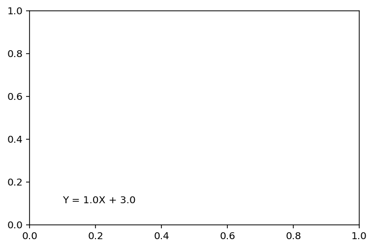
Task: Below, create a text string for the fitted line equation, in the form of Y = MX + B, where M is your slope, and B is your intercept. In other words, it should look something like this:
Y = 1.0X + 3.0
Assign the fitted line equation to a variable called label.
label = ...
Add text for your fitted line to the plot (optional)#
It is useful to report the fitted line equation either on the plot itself or in the figure caption. The code below will show you how to add text using plt.text(), which takes three arguments: the x,y location of the text as well as the string itself (s). If you’d like, you can integrate this into your code above.
plt.figure()
plt.text(x = 0.1, y = 0.1, s = label)
plt.show()
Additional notes & resources#
Another way to generate a scatterplot with a linear regression line is the seaborn regplot function!
About this Notebook#
This notebook was created by Ashley Juavinett for classes at UC San Diego.