Importing LabChart Files (Excel)#
The steps below will help you import and plot your LabChart .txt files using Microsoft Excel.
Note
If all of the steps below look a lot of work to simply replot a recording trace — you’re right, it is. And so, we have a Python script for that! Check the other notebook, Importing in Python.
On Windows#
Open a New Sheet in Excel.
Go to
File > Open > Browseand navigate to where your text file is saved.Change the file type to “All files” and open your .txt file.
In the next window(s), hit Next. In the following (screenshot below) make sure that the Delimiter is set to Tab, and click Finish. The data preview should have multiple separated columns and look something like this:
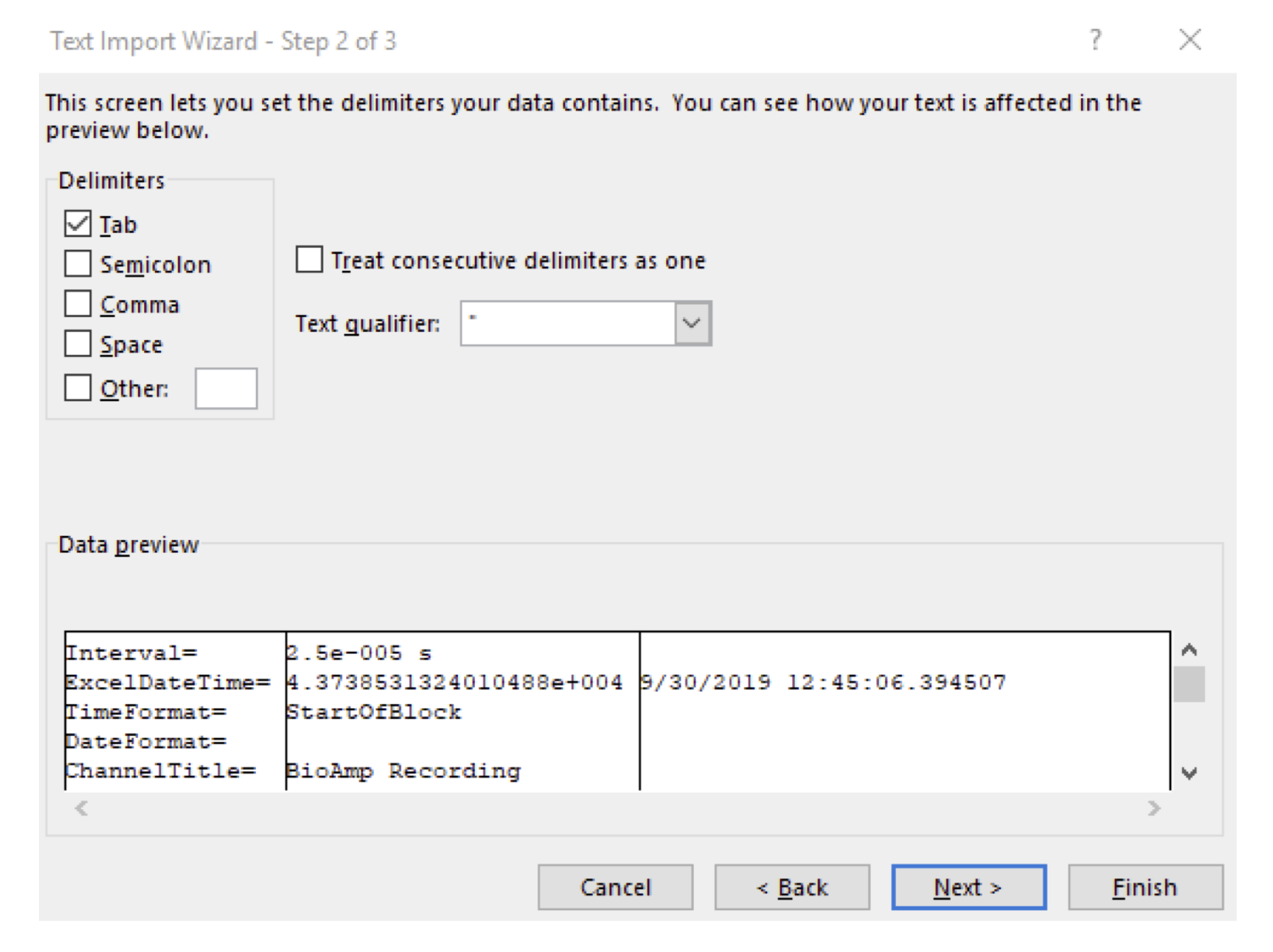
This file will have multiple columns. The first column will contain the timestamps for your experiment, in seconds. The second column will be the first channel of data that you’ve exported. In the example above, it is the stimulus channel. The third column will be the second channel of data, etc.
Note
If you have exported all of your data, each page of your experiment will be vertically concatenated. In other words, it will start at 0 and go to the end of Page 1, and then start at 0 again for the next page.
Select the cells containing the data you would like to plot (if you exported the stimulus channel, it’s the third column; if you didn’t export the stimulus channel, this should be the second column of your file).
Go to
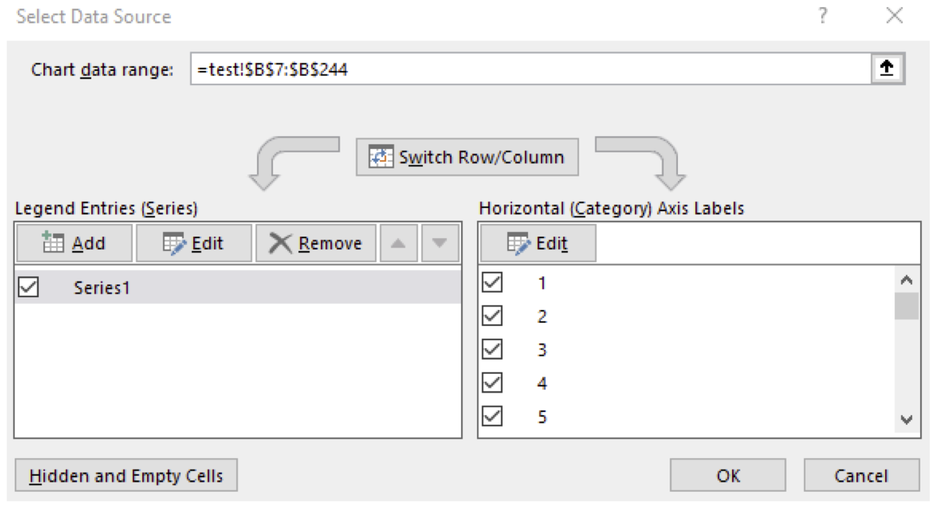
Insert > Line Chart.To add the correct time axis labels, right click on the chart and choose “Select Data.”
In the next window, under “Horizontal (Category) Axis Labels” choose “Edit.” In the window that pops up, select all of the time values (the first column of your file):
From here, you might need to adjust the Horizontal Axis crossings in order to prevent the X axis from directly crossing your data (since your data will likely hover around zero, where the axis goes by default). For example, you might want to have your X axis cross at -100 mV, so that it doesn’t overlap with your data.
Format your plot with axes labels and a title, and make any additional changes as necessary.
On Mac#
Open a New Sheet in Excel.
Go to
File > Open > Browseand navigate to where your text file is saved.Change the file type to “All files” and open your .txt file.
In the next window(s), hit
Next. In the following (screenshot below) make sure that the Delimiter is set to Tab, and clickFinish. The data preview should have multiple separated columns and look something like this: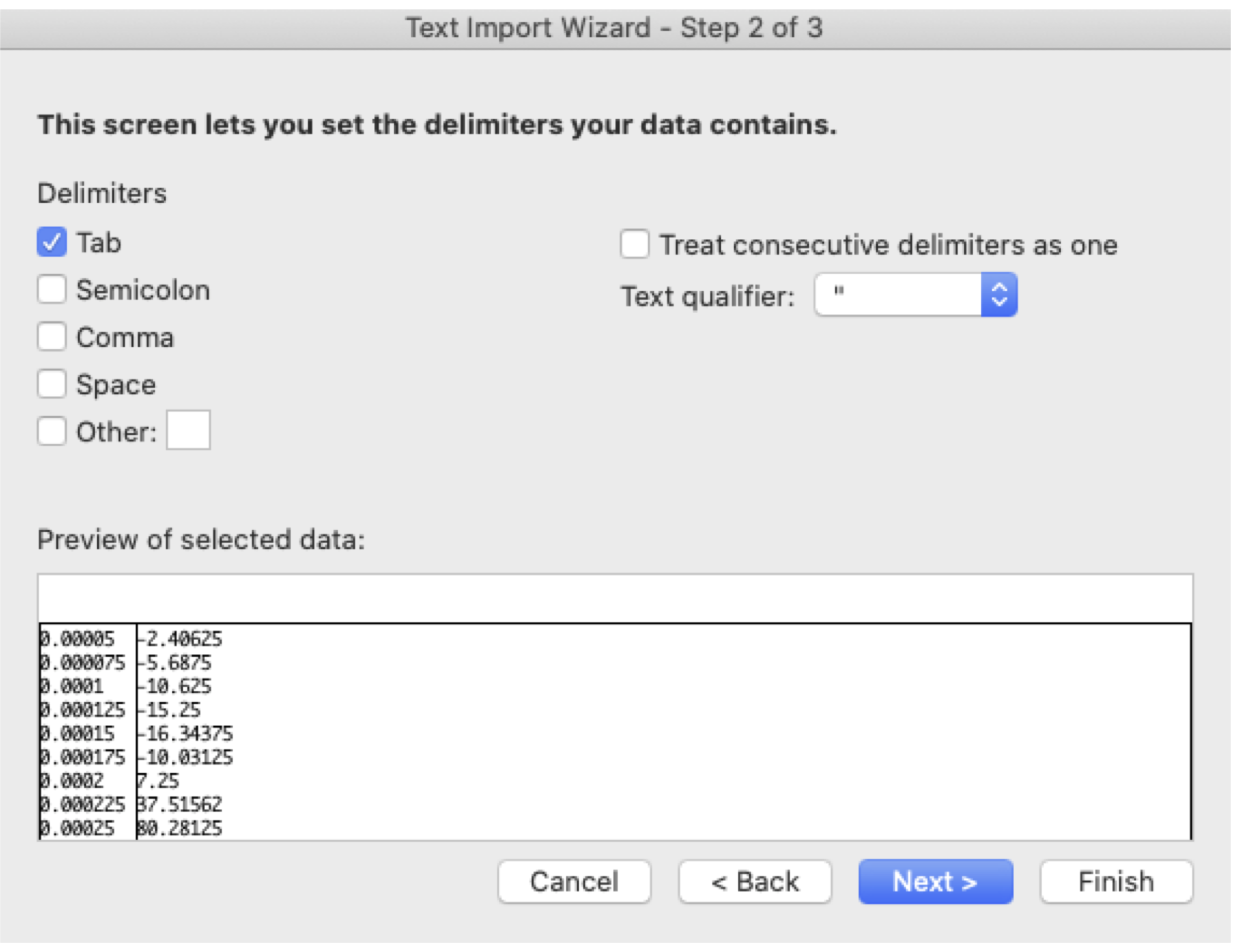
Note
This file will have multiple columns. The first column will contain the timestamps for your experiment, in seconds. The second column will be the first channel of data that you’ve exported. In the example above, it is the stimulus channel. The third column will be the second channel of data, etc.
If you (accidentally) exported all of your data, each page of your experiment will be vertically concatenated. In other words, it will start at 0 and go to the end of Page 1, and then start at 0 again for the next page.
Select the cells containing the data you would like to plot (if you exported the stimulus channel, it’s the third column; if you didn’t export the stimulus channel, this should be the second column of your file).
Go to Insert > Line Chart.
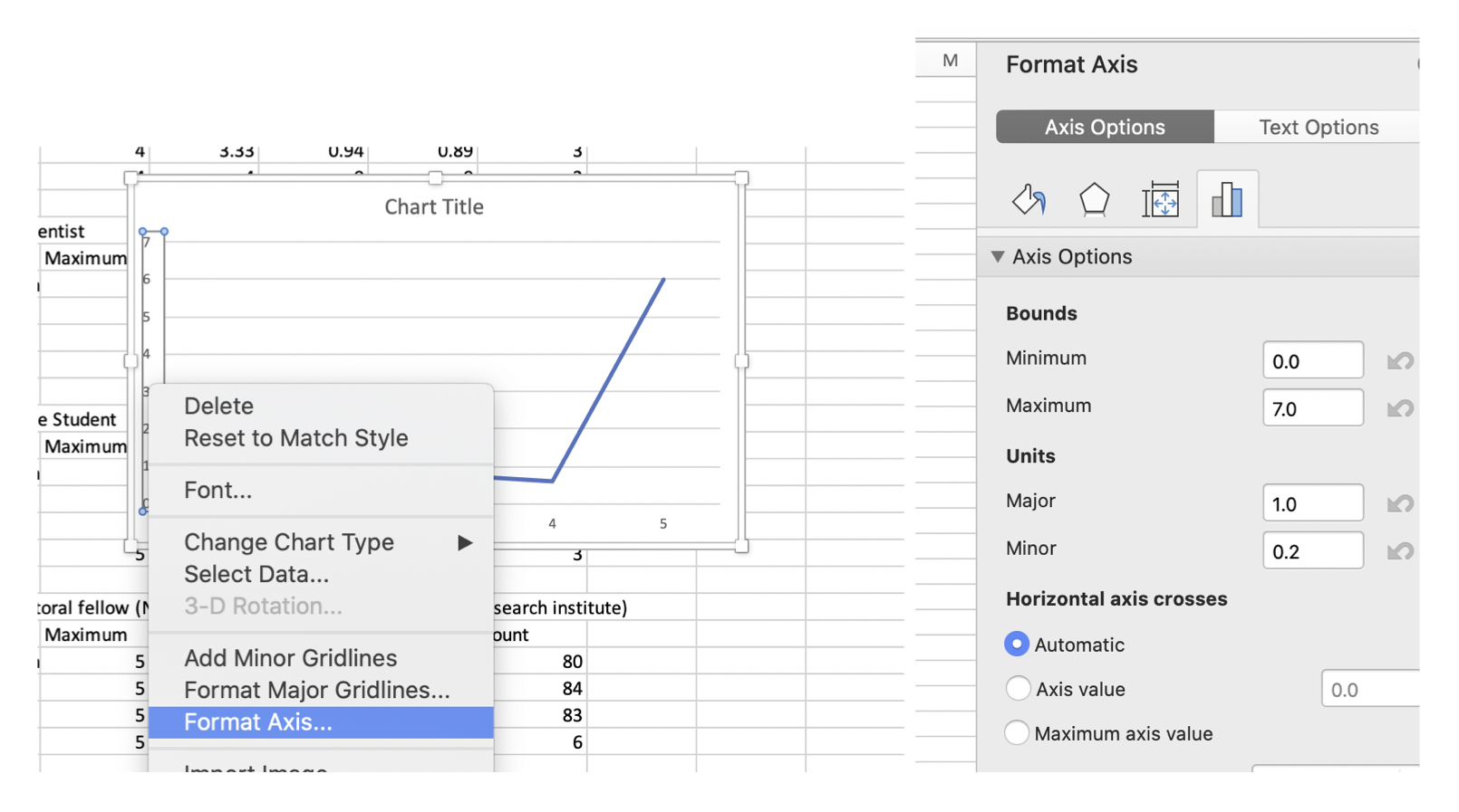
To add the correct time axis labels, click on
Select Dataunder the Chart Design menu.Where it says “Horizontal (Category) Axis labels, click the button to the right with the tiny red arrow.
Select all of your time stamps in the Excel file (the first column) and press Okay. Your x axis should now be updated with the time, instead of the samples.
From here, you might need to adjust the Horizontal Axis crossings in order to prevent the X axis from directly crossing your data (since your data will likely hover around zero, where the axis goes by default). For example, you might want to have your X axis cross at -100 mV, so that it doesn’t overlap with your data. You can do this by clicking on an Axis, and modifying the “Horizontal axis crosses” in the “Format Axis” menu on the right (under the tab with the ). Alternatively, you can right click on the axis, and choose “Format Axis”, which will open the same menu.
Format your plot with axes labels and a title, and make any additional changes as necessary.